
Pantone Colors Explained
“The Pantone Color Matching System is largely a standardized color reproduction system. By standardizing the colors, different manufacturers in different locations can all refer to the Pantone system to make sure colors match without direct contact with one another.”
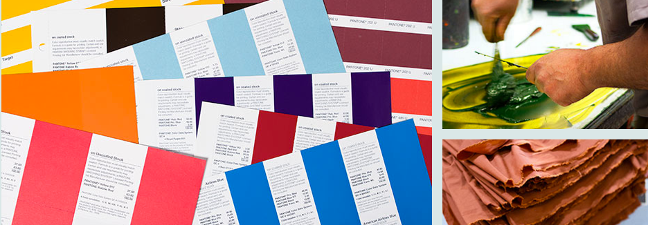
This helps with manufacturing. Think of the way our world works today… a designer in NYC may dream up a colorful palette of tangerine orange and navy. The fabrics he/she wants may be purchased from India and need to be dyed to match perfectly to the collection. In order to be sure the colors visualized are exactly as they should be in reality, the team will use the Pantone color system. The system uses a combination of four inks—cyan (think blue), magenta, (think red/pink), yellow and black. Otherwise known as CMYK. With varying amounts of each of the four inks in the mixture used for the dye, everyone involved in the project will end up with the exact same color.
How are the Pantone colors for every season chosen? Pantone Inc. invites a secret committee of 10 people to meet every May and November in Europe to decide on the color trends for Fall and Spring. Pantone was started in 1956 as a commercial printing company and has grown to act as the end-all be-all in the business of color. This secret committee is said to consist of bigwigs from many industries that deal with color: think fashion, interior design, cars, furniture… All the industries where color matters.
Why would designers care what Pantone colors are chosen? Not all designers do. But the truth is, the Pantone colors selected typically drive the color trend. If a designer wants to be “on trend” they need to pay attention to the Pantone color forecasts, if not, they risk being seen as irrelevant… and no one likes that!
Photo cred: Pantone Inc.
 https://www.michaelsconsignment.com


